Explore cluster state with the topology visualization
As a Nomad cluster grows, the exact state of allocations and clients can become a mystery. For the most part this is a good thing: it means Nomad is quietly scheduling workloads without any need for intervention. However, as an operator, it is reasonable to still want to know what is going on within your cluster.
The topology visualization is a single view of an entire cluster. It helps you perform preventative maintenance and it can help you understand your cluster's particular behaviors.
Prerequisites
This tutorial assumes basic familiarity with Nomad. You must have access to an existing cluster that is running one or more jobs.
Here is what you will need for this guide:
- An active Nomad >=1.0.0 cluster
- Access to the cluster's web UI
- Read permissions to one or more namespaces
Navigate to the topology visualization
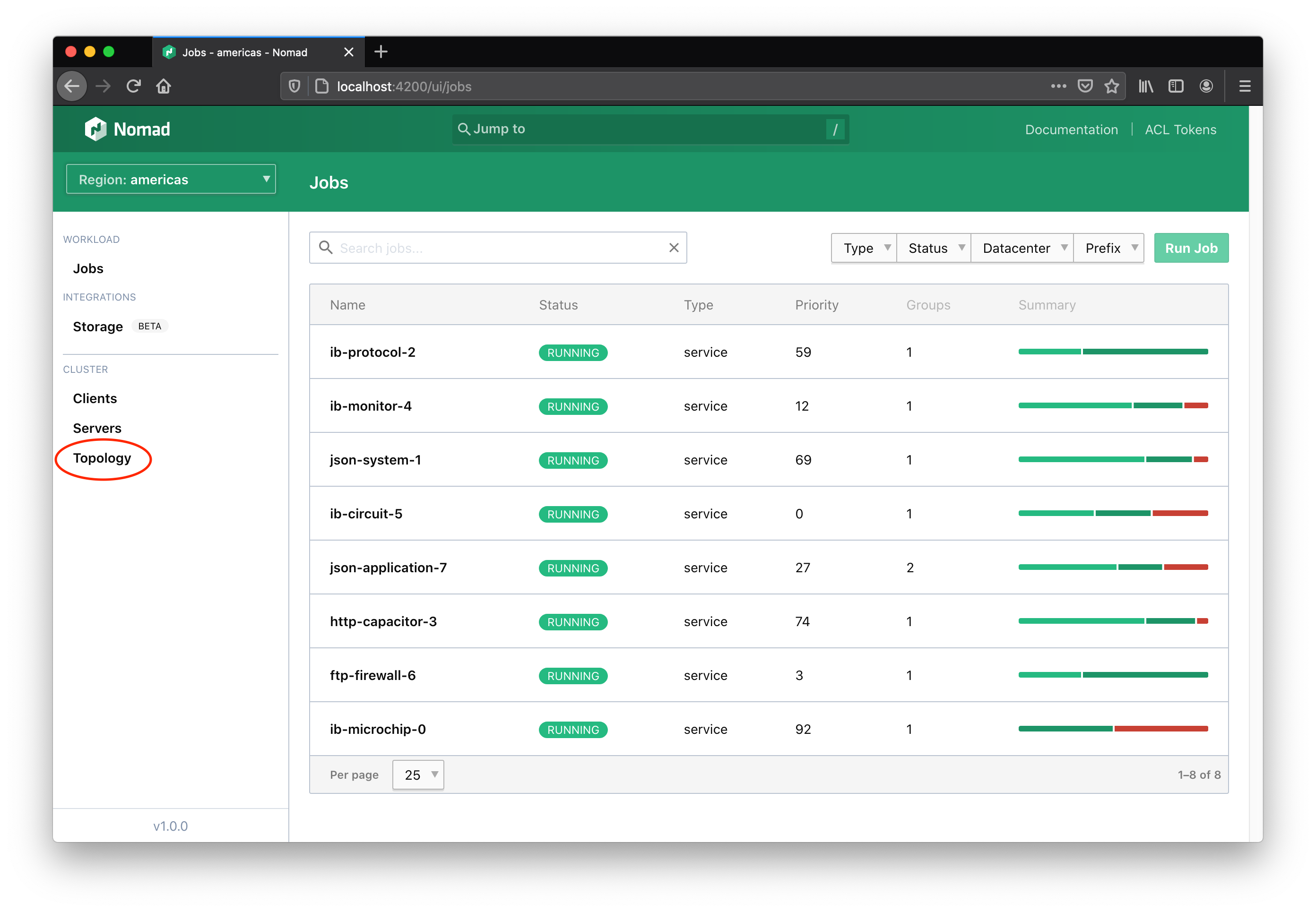
The global left-hand navigation of the web UI has a Topology link under the cluster section. This link will take you to the topology visualization.
The elements of the visualization
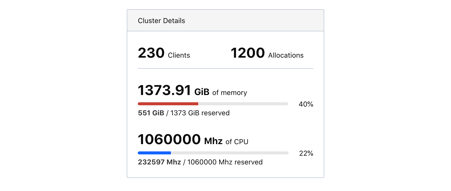
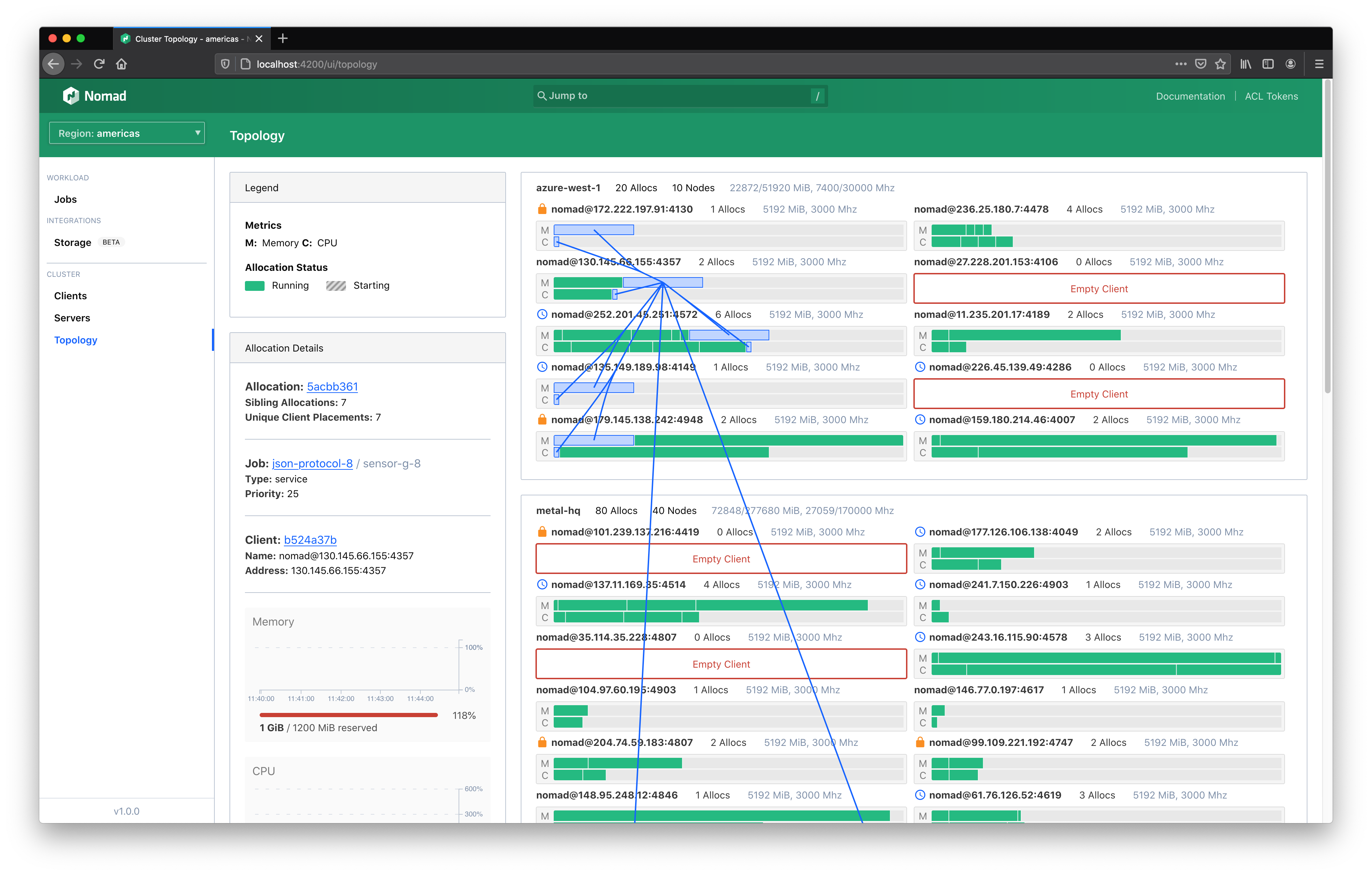
The left-hand information panel contains aggregate cluster statistics. This includes the sum total of memory and CPU (in MHz) available to Nomad. The percentages of memory and CPU tell how much of each resource has been reserved—not how much is currently utilized. For instance, if a Docker container is currently utilizing 30MiB of memory but the task declared the need for 500MiB in the job spec, then the topology visualization will count this allocation as 500MiB.
These aggregate metrics are meant to give a rough sense of scale and can answer immediate forecasting questions. If your cluster is currently at 80% capacity of a total 200GiB of memory and you know your services will only grow in the next year, then you can conclude that the capacity of the cluster will also have to grow.
Be careful not to assume there is room for your allocation just because the aggregate remaining resources are less than what your job requires. Since resources are aggregated but allocations must be placed on a single client, it's possible that no client has room for your allocation. If there is 1500MHz of CPU available across a cluster but only 500MHz available per client, then a task that needs 600MHz of CPU cannot be placed.
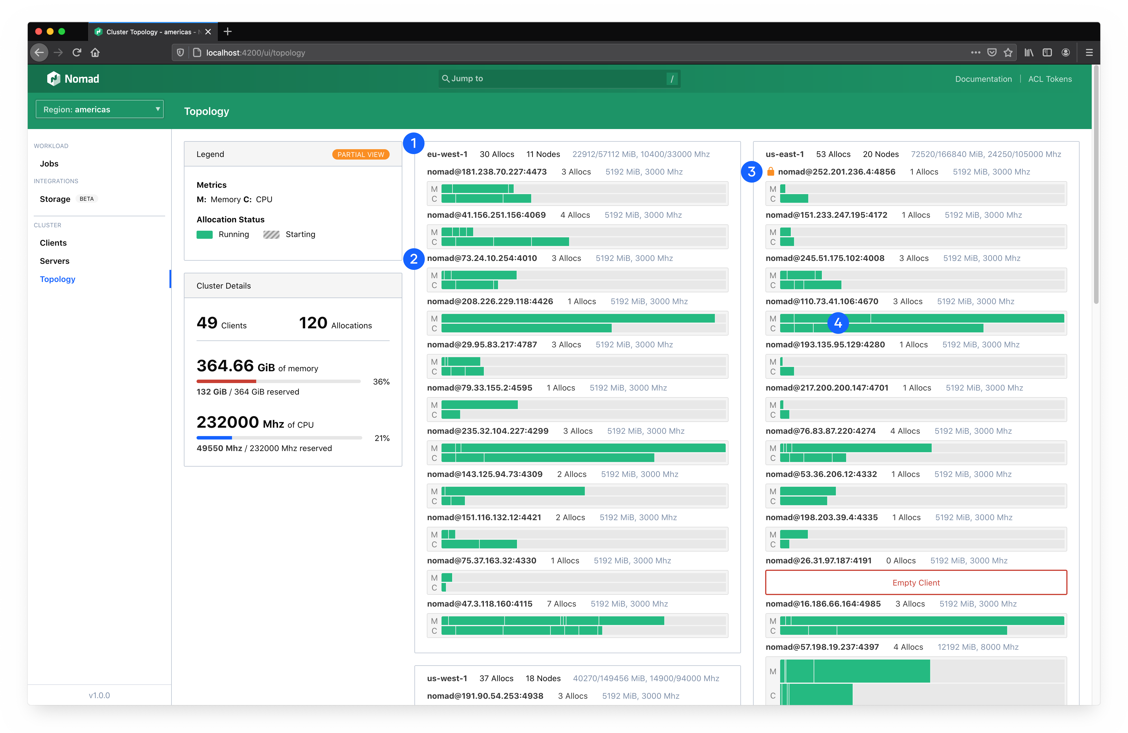
The main visualization organizes all of your datacenters and clients and brings focus to your allocations.
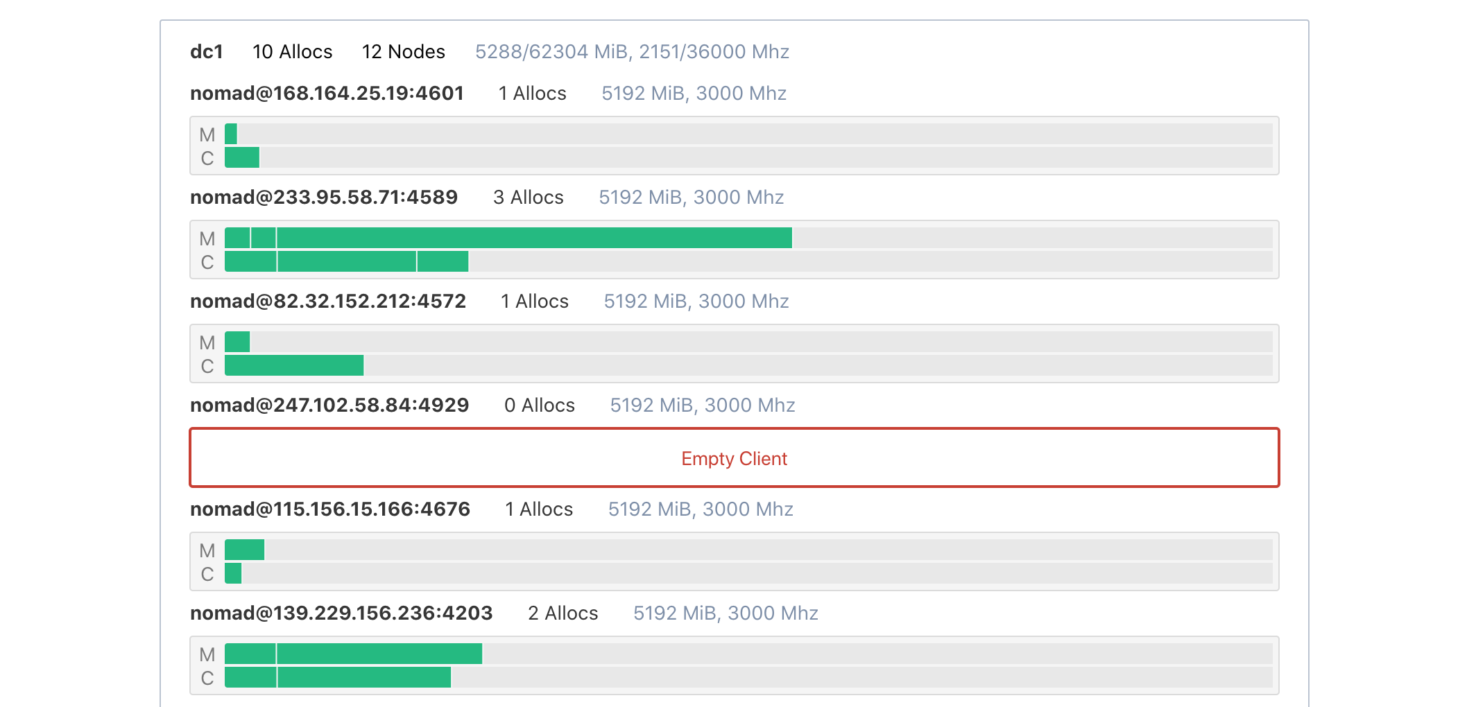
The outermost section represents a datacenter (1). Each section is labeled by the datacenter name, capacity, and status. Clients are rendered within their respective datacenter. Clients will also be labeled by their name, capacity, and status (2). This also includes icon indicators of scheduling eligibility and drain state (3).
Clients across your entire fleet are sized vertically based on their capacity. Clients with more total capacity are taller. This makes scanning a cluster easier.
Within each client container are two rows; one for each primary scheduling unit (CPU and memory). Each row will include each allocation on the client scaled proportionally to the amount of resources reserved for it (4). An allocation for a task group that requires 8GiB of memory on a client that has 32GiB total will occupy 25% of a client row.
Interact with the visualization
The topology visualization is designed to presennt as much information as possible in a single view. More information can be expanded by hovering or clicking on specific elements.
Hovering over allocations will open a tooltip that gives quick details including the specific allocation reservation requirements and the job the allocation belongs to.
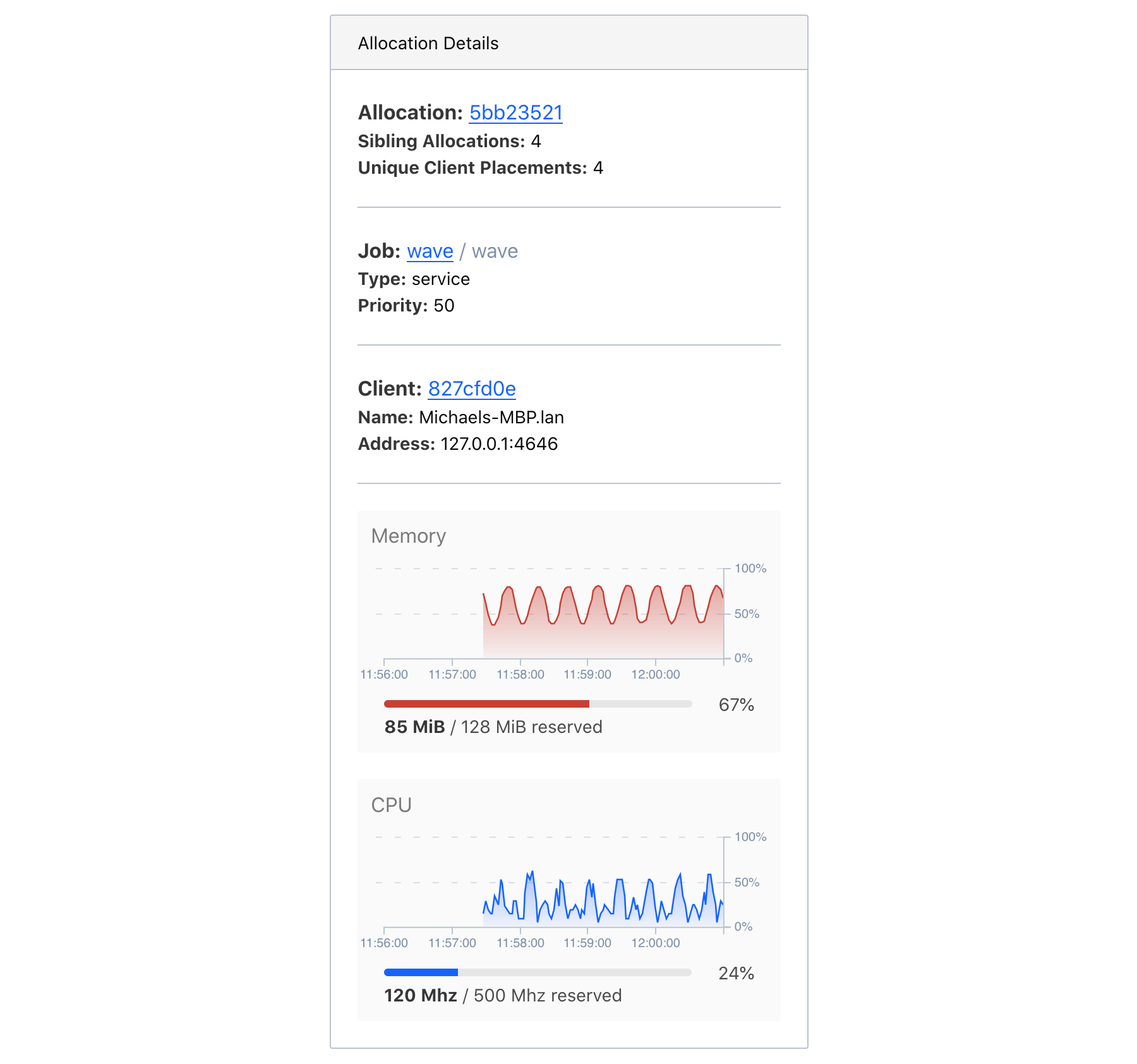
Clicking an allocation will select it and swap out the cluster aggregate statistics in the information panel with allocation information. This includes links to the allocation, the job the allocation belongs to, the client the allocation is running on, and the current resource utilization over time.
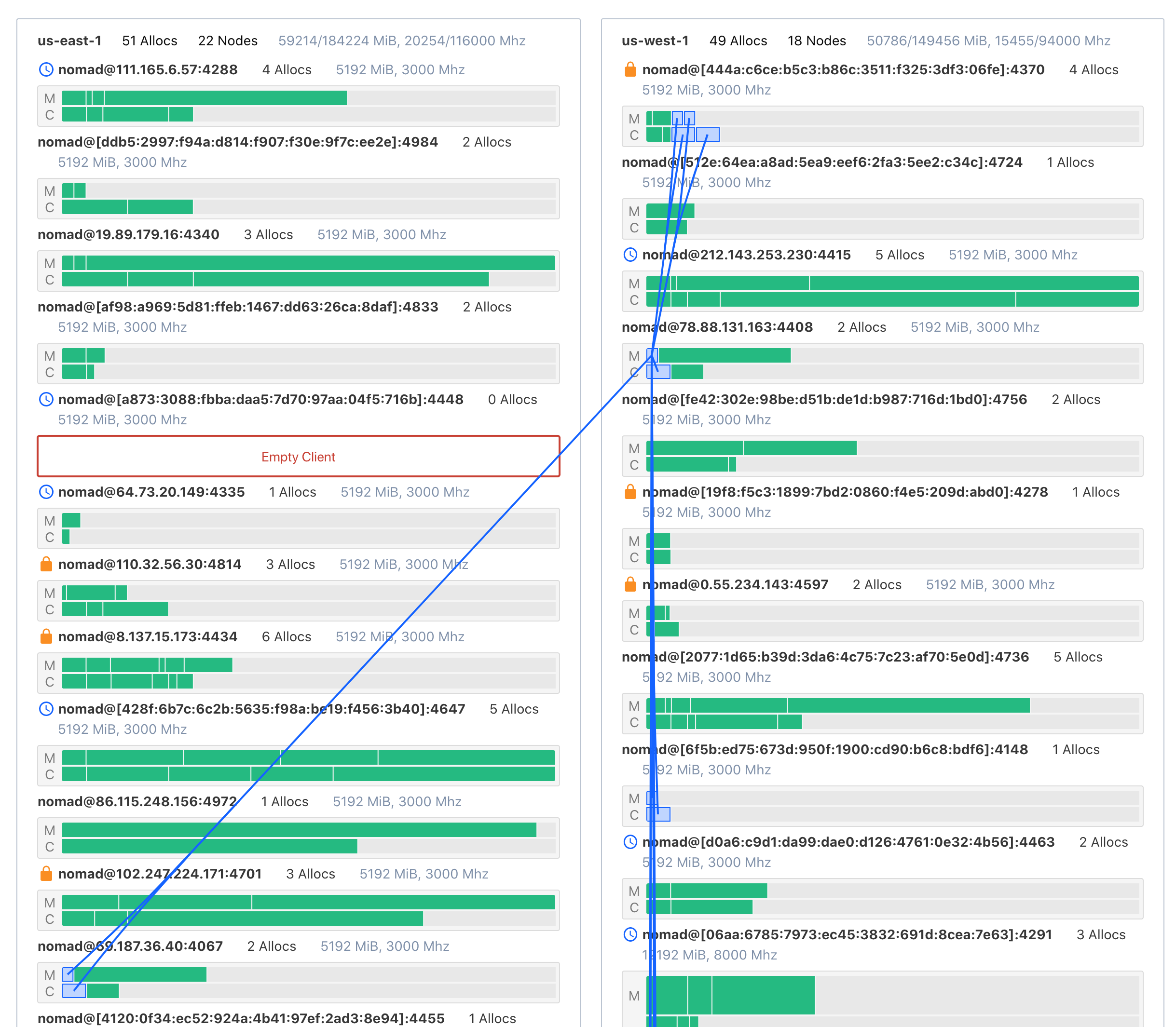
In addition to the information shown in the panel, when an allocation is selected, associations among all allocations for the same task group and job will be drawn. This helps convey the distribution of a single task group across a cluster.
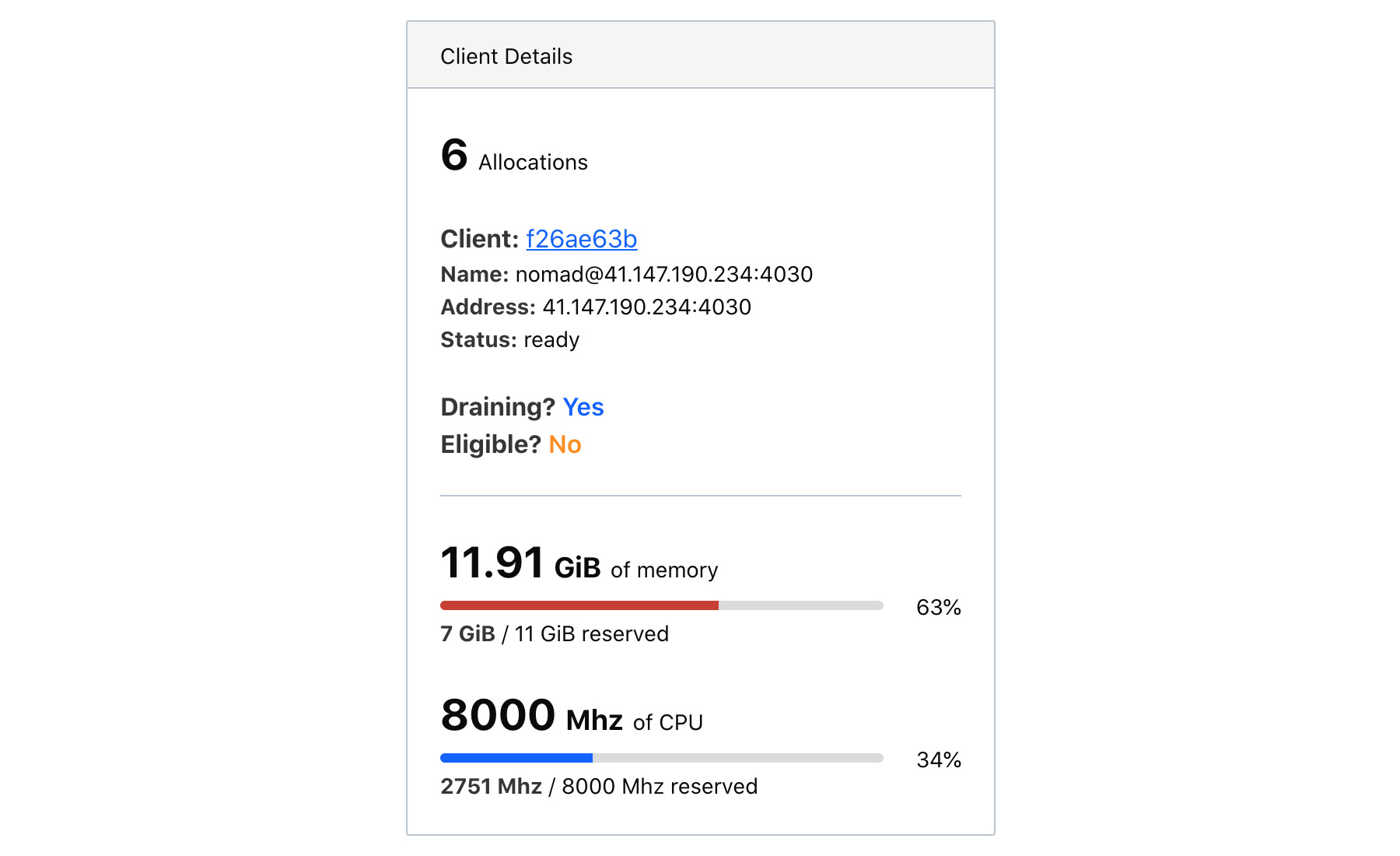
For large clusters, the topology visualization will hide the client labels. When this is the case, clicking a client will expand client details in the information panel.
Effective use of the topology visualization
The topology visualization is intended to be an open-ended exploration tool. Here are a few example explorations that the visualization is particularly well-suited for.
Identify excessive client provisioning
Sometimes clients are provisioned separately from application sizing and placement. This can lead to a drift between the expected client requirements and the actual requirements. Clients with no allocations still cost money.
This can be quickly detected with the topology visualization. Empty clients are highlighted in red and labeled as empty.
Is this a problem you have? Consider using horizontal cluster autoscaling.
Spot potentially hazardous or flaky allocation distributions
Nomad will automatically place allocations based on the requirements and constraints declared in the job spec. It is not uncommon for jobs to have missing constraints due to human error or unknown caveats. This class of error will often make itself known when the task starts, but sometimes the error is invisible and only surfaces through a peculiar error rate.
For instance, imagine a service Service A that has five allocations. Four are in datacenter West and one is in datacenter East. Service A must talk to Service B, but due to networking rules, they cannot communicate across the datacenter boundary. If Service B is in datacenter West, then 80% of Service A traffic (assuming a uniform distribution) will work as intended while the remaining 20% will error. Or worse than error: silently behave incorrectly.
This is easily remedied with a datacenter constraint in the job spec, but the problem must first be identified. Since the topology visualization will associate all allocations for Service A, this can be quickly spotted.
Find noisy neighbor risks
By default, tasks in Nomad have soft CPU limits. This lets tasks occasionally spike over their allotted CPU while still allowing for efficient bin-packing of allocations on a single client.
It is possible for many allocations on a single client to exceed their CPU soft-limit—or for one allocation to greatly exceed it—starving other allocations of CPU. This can cause degraded performance and anomolous errors to arise from untested race conditions or timeouts. In this case, the problematic allocation is only problematic due to the external circumstances of the client it was scheduled on.
The topology visualization makes it very clear when an important allocation is scheduled alongside many other allocations on a densely packed client. This alone doesn't mean there is a noisy neighbor problem, but it might be enough to defensively modify the job spec. Adding more CPU headroom or constraints can help stabilize the service.
Next steps
The topology visualization is a useful tool for learning to use Nomad and for understanding your cluster at a moment in time. It does not show historical allocation reservation information.
To get deeper utilization and historical data, you will need to set up a monitoring stack using Nomad's telemetry data. The topology visualization may inform your own custom dashboards as you invest in setting up operations tooling for your specific needs.
